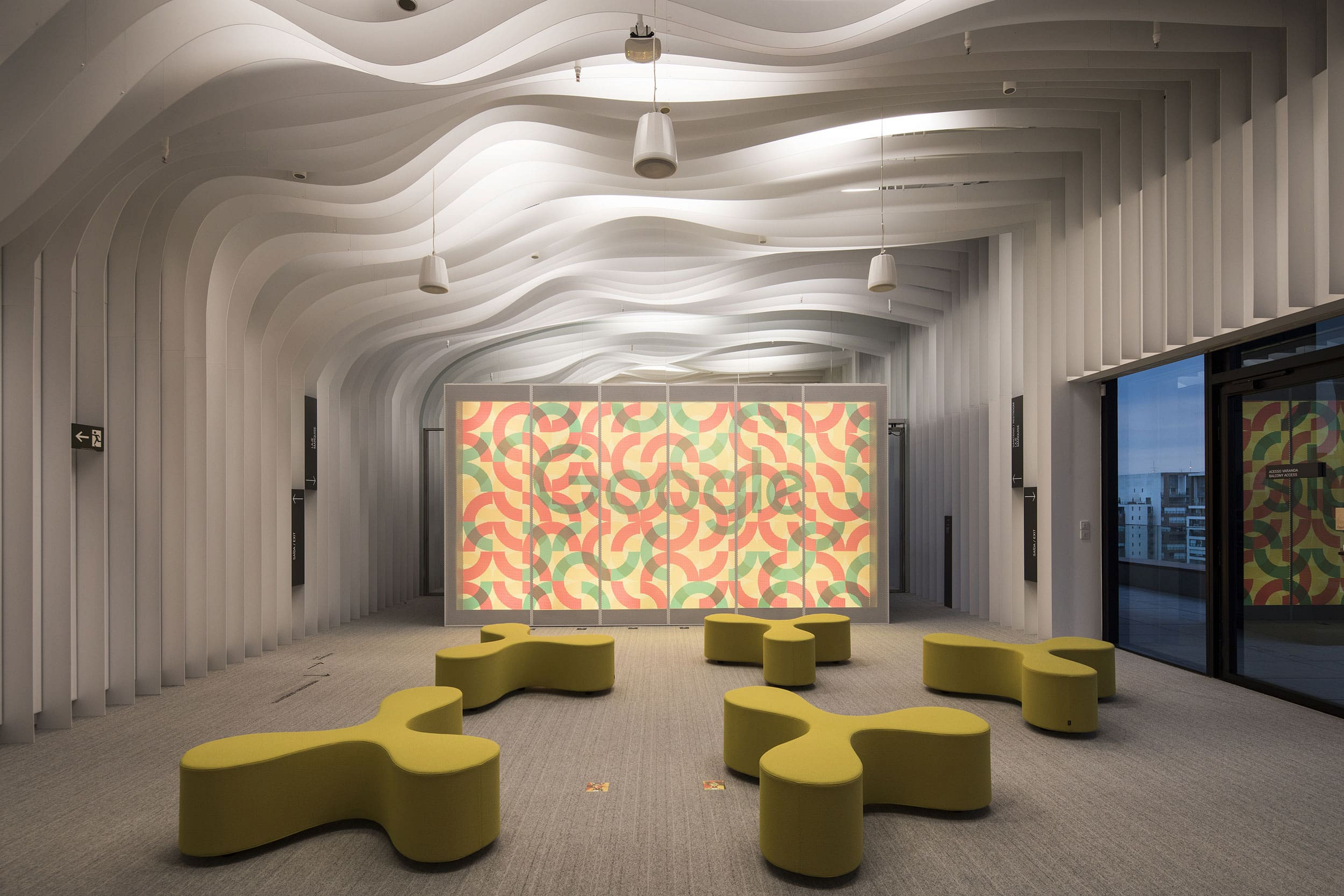


Quem Disse Berenice?
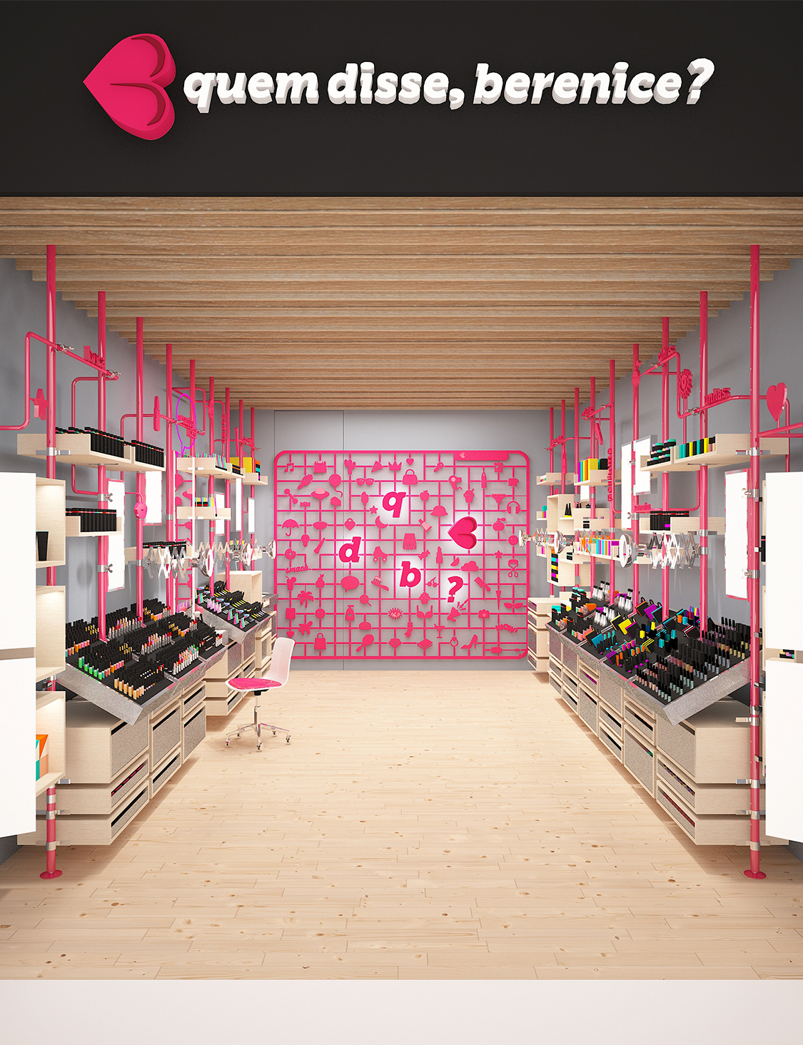
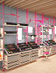
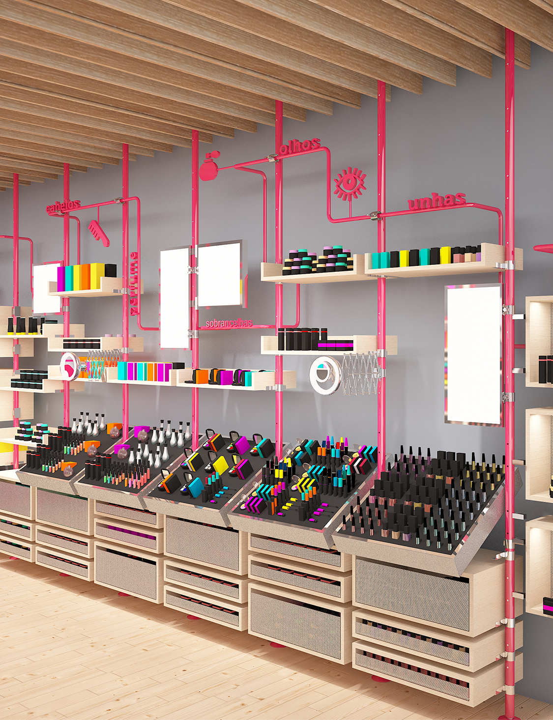
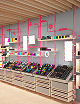
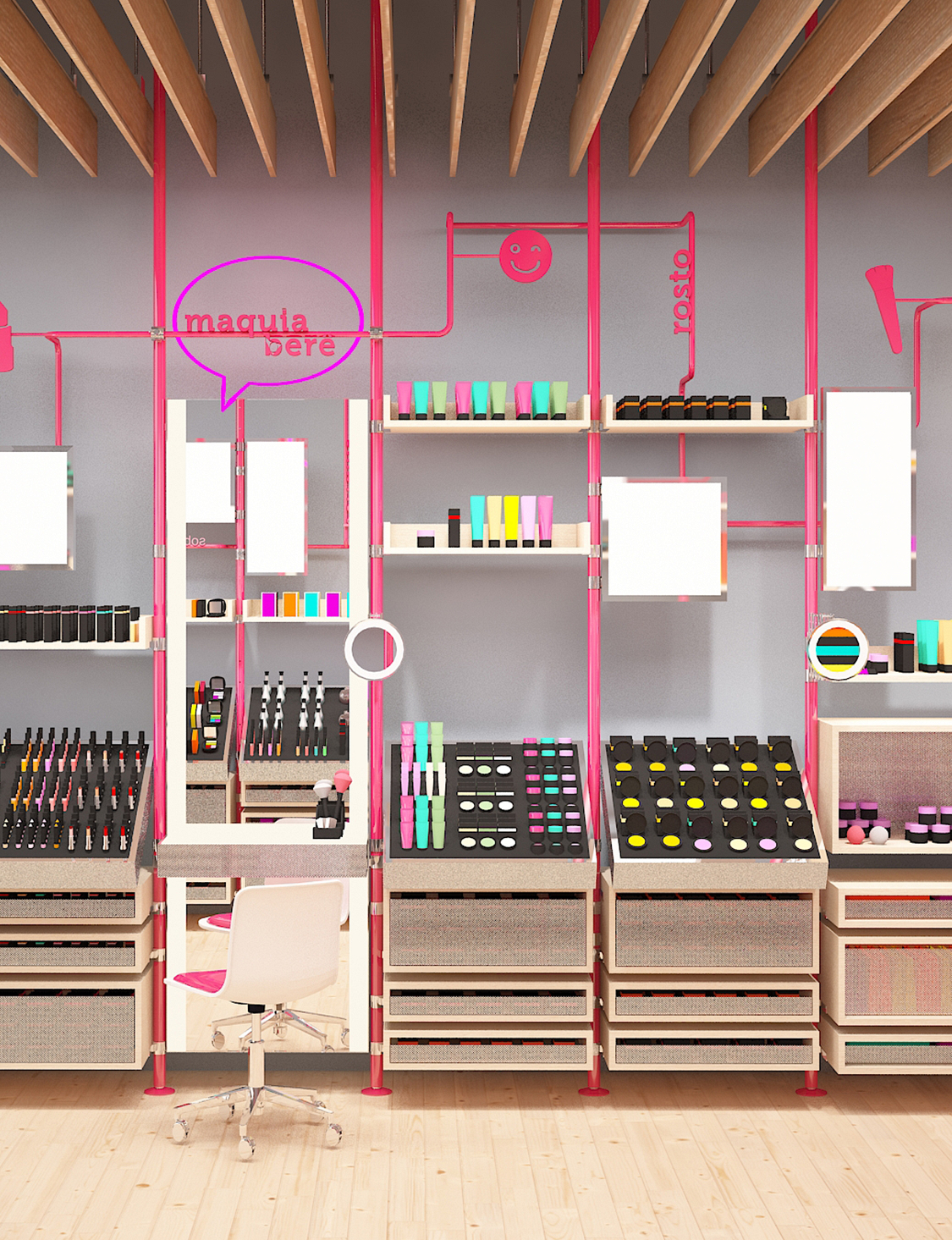
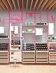
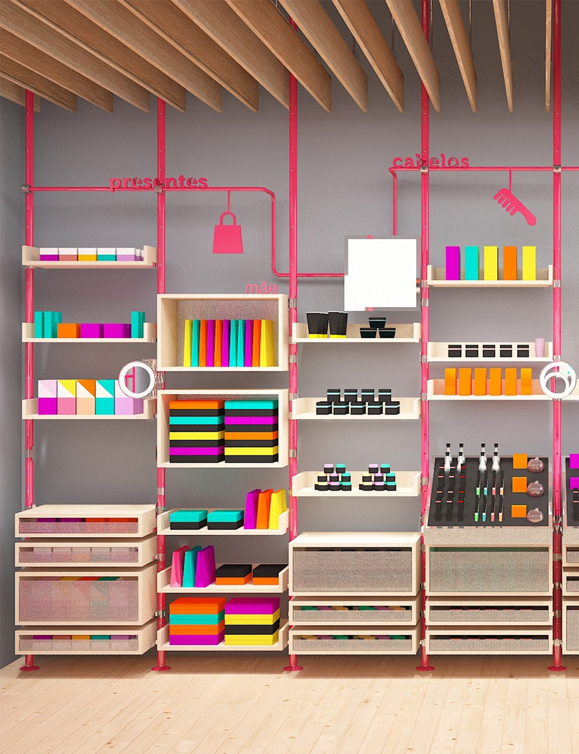
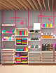
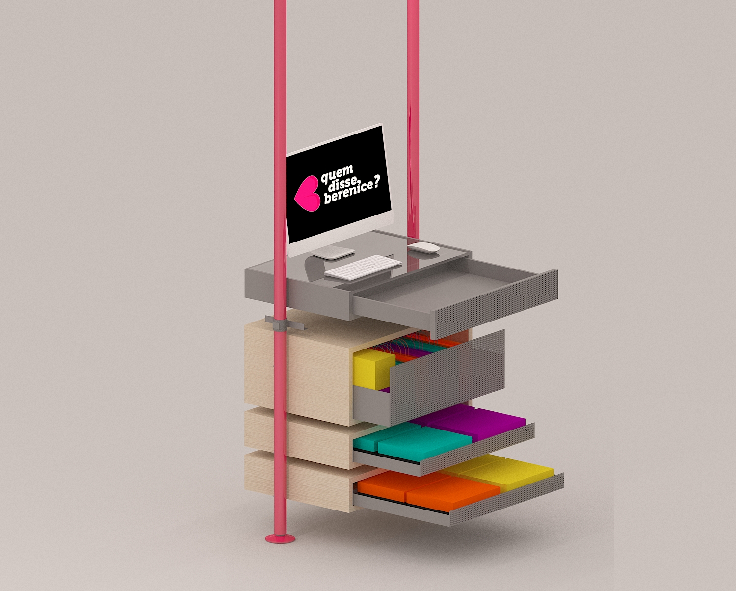
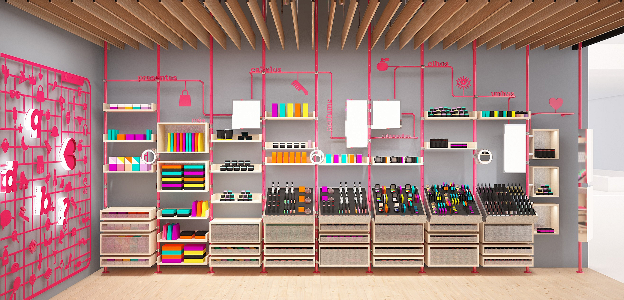
Brazil 2018In our interpretation, the idea of freedom for the new quem disse, berenice? store finds a perfect parallel in an increasingly widespread movement around the world: DIY – do it yourself. This movement points towards an autonomy of people not only in relation to traditional tasks, but also to the newest aesthetic experiences in the field of design. The DIY universe is our reference for the solution of the architectural, graphic, lighting, and communication elements, in order to make the concept of freedom tangible in the store. In short, the store is a large KIT of assembly parts, a reference that is recognizable and interpretable by anyone. The chosen materials and colors reflect the intended ambiances' dichotomies and are defined by contrast. On one hand, light-colored wooden furniture, flooring, and ceiling establish coziness for the space and express the brand's maturity; on the other hand, perforated metal mesh drawers; metallic structure and "Revell kit" type elements in the brand's color; a profusion of graphic elements, symbols, "emojis" and communication displays provide the new store with high spirits and attitude. We also consider that the display supports should always maintain neutrality and contrast in relation to the products, so that their colors and diversity of forms can stand out and, of course, contribute significantly to the overall store ambiance.
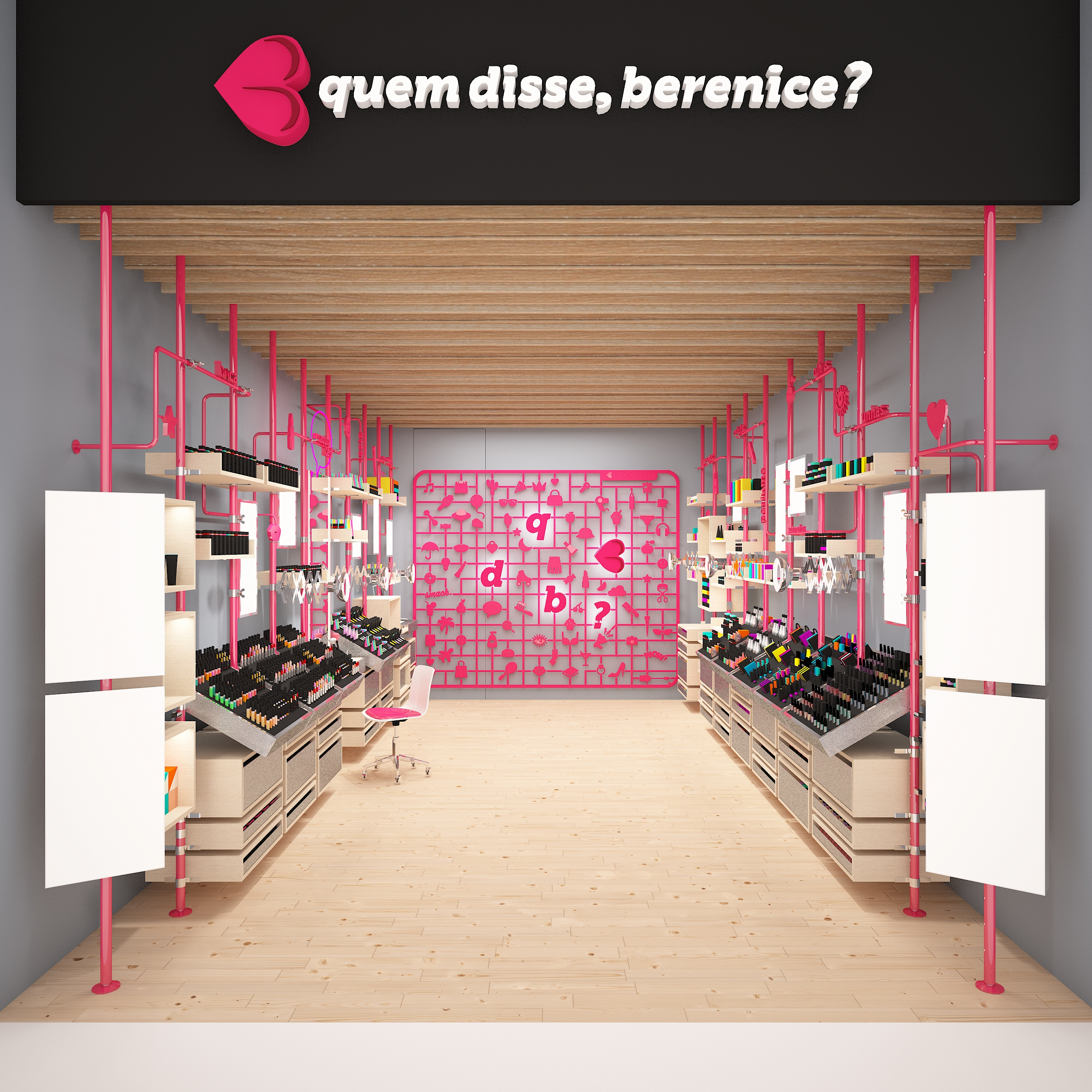


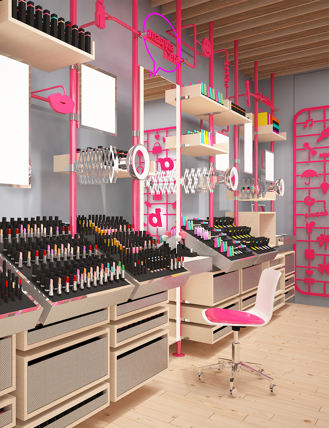
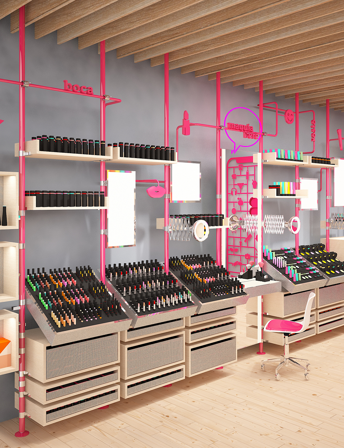
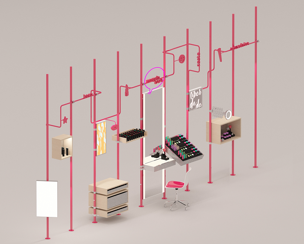
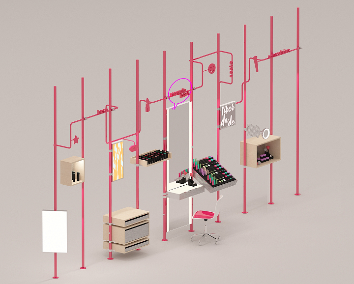
We propose the translation of the DIY concept to the new store through the creation of an integrated system of architecture, design, lighting, and communication that is characterized by flexibility and the possibility of adaptation. An imaginary grid, a striking modular structure that guarantees rhythm and order, and a menu of solutions for product storage and display, back-light and touch-screen displays, luminaires, and mirrors.
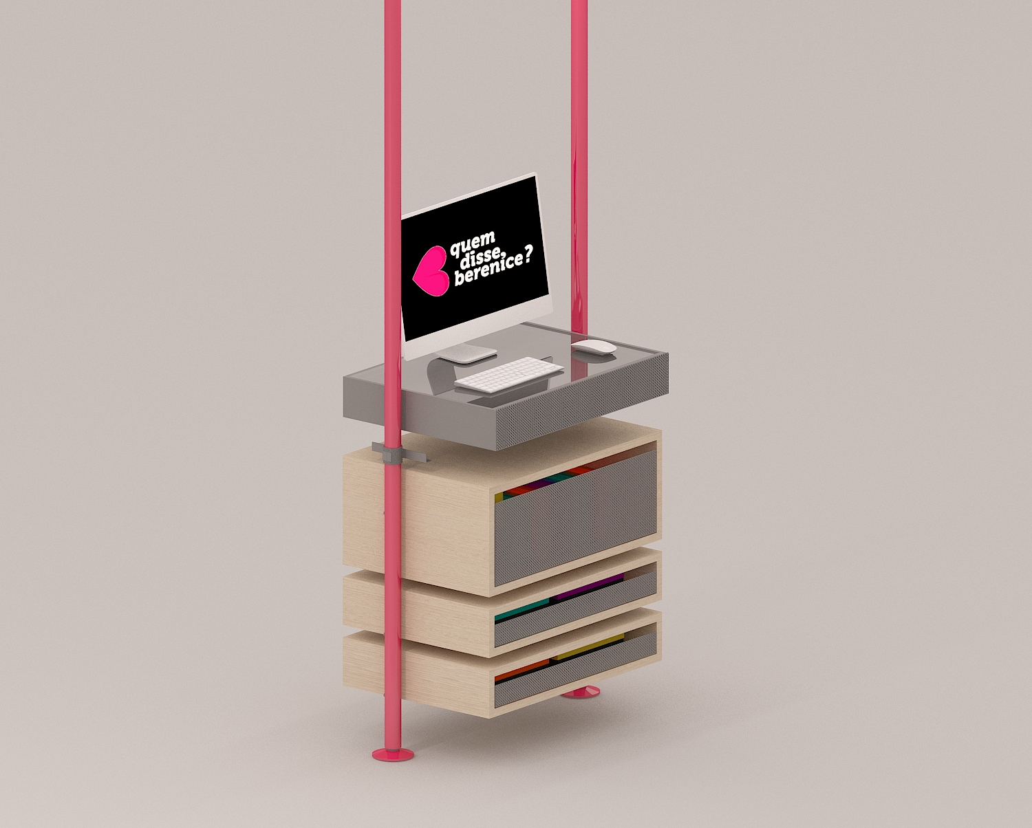
In addition to responding to a strong concept that is coherent with the brand's principles, the modular KIT assembly solution favors the store's adaptation to spaces of the most diverse natures and dimensions, enhancing the multi-channel nature of qdb?. All constructive elements, for the most diverse functions, are integrated into the store's assembly KIT, composing a diverse and, at the same time, ordered system.
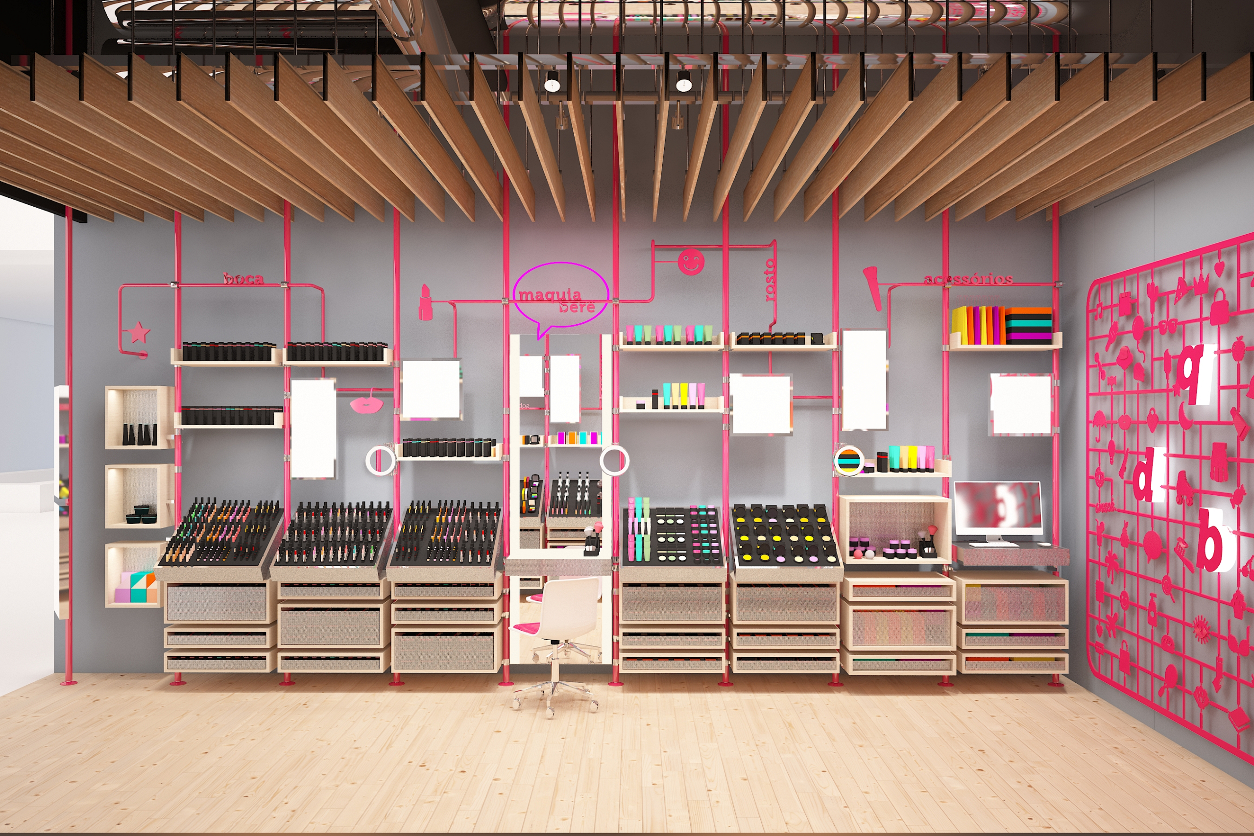
The product groups are easily identifiable and organized by the modulation of the tubular structure and the design solutions – typography and pictograms. The vertical elements in cherry color establish a vertical connection between the storage and display elements, guiding the eye and providing continuity in the reading.
Pieces that are generally visually heavy, such as the low stock cabinets, are “exploded” into smaller parts, expanding the concept of assembly pieces, giving more lightness and allowing for better vertical integration in the language of the elements that compose the furniture.
The cash counter is also integrated into the modular system, next to the side wall, ensuring a clear view of the DIY graphic panel on the back wall. Although it may seem like a subtle change, this is a very effective way to amplify the impact of this graphic element with a strong conceptual appeal and, with this, pique curiosity and invite people to enter the store.
The Revell at the back of the store is the focus of attention and the surprise element that will intrigue those who pass in front of the store. By being a material whose principle is assembly and autonomy, the Revell panel adds a modern aesthetic of shared creative workshops, making the freedom of experimentation tangible and the possibility of diversity in composition. The store becomes a large assembly kit, which recognizes and reinforces the concept of the protagonist-consumer. Spreading out from the Revell, the internal signage replicates the aesthetic of creative workshops throughout the store, moving through the sessions, experimenting with diverse levels without being constrained by a movement pattern.
Project: Quem Disse Berenice? Store
Year: 2018
Authors: Bruno Campos, Marcelo Fontes, and Silvio Todeschi (BCMF Arquitetos), Fernando Maculan, and Mariza Machado Coelho (MACh Arquitetos)
Team: Marcos Sales, Ricardo Lobato
Graphic Design / Signage: Hardy Design
Lighting: Atiaîa Design
Status: Project (Competition)