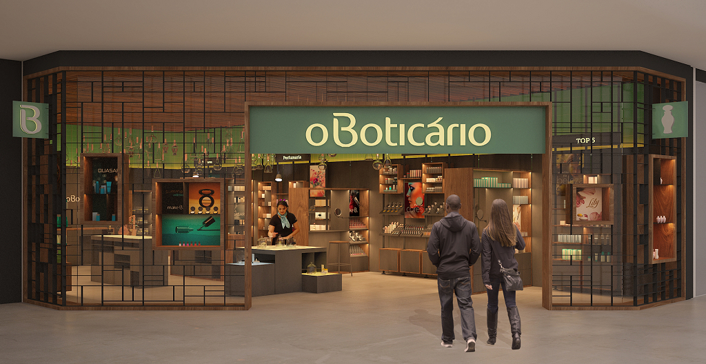
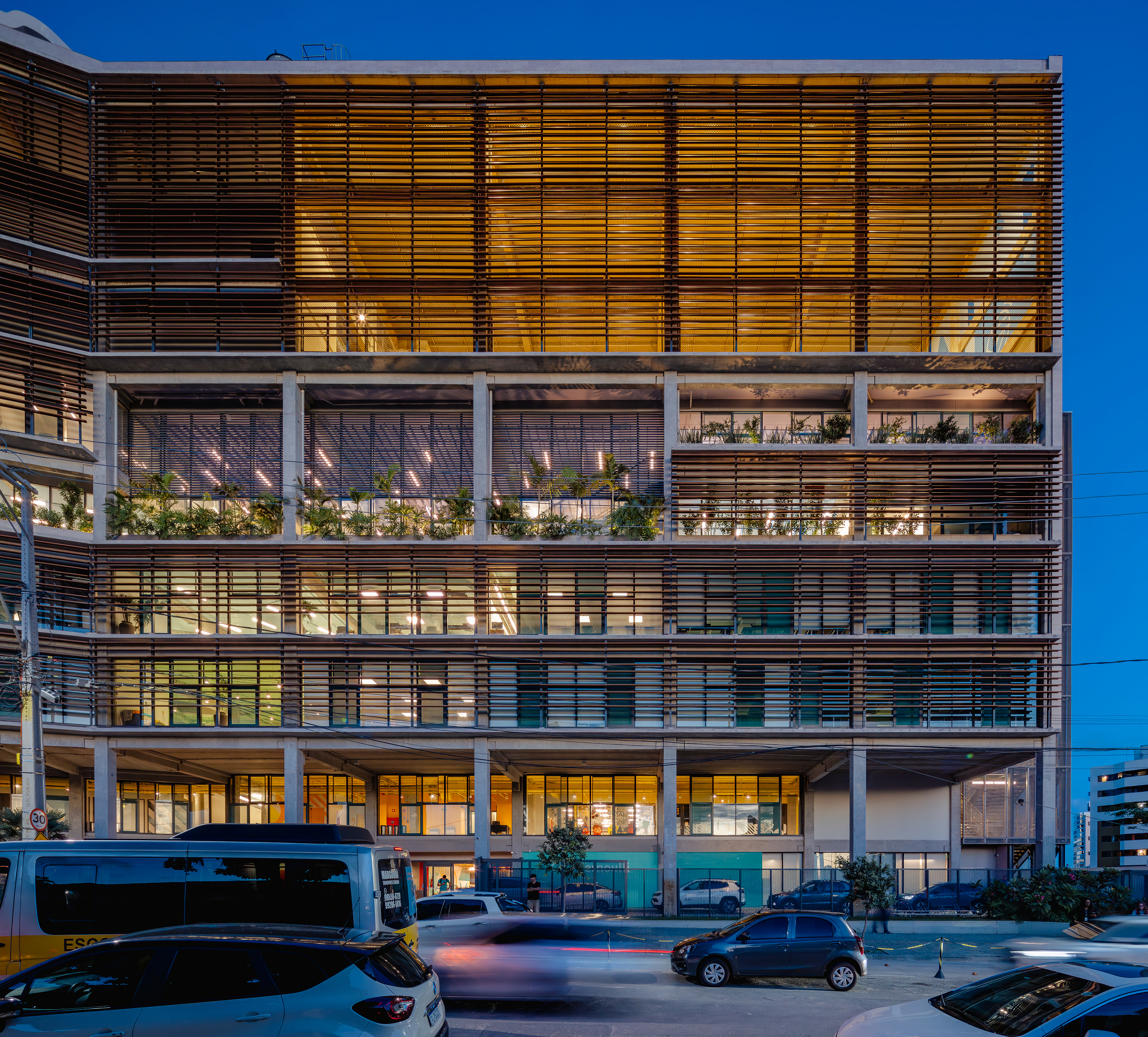


O Boticário
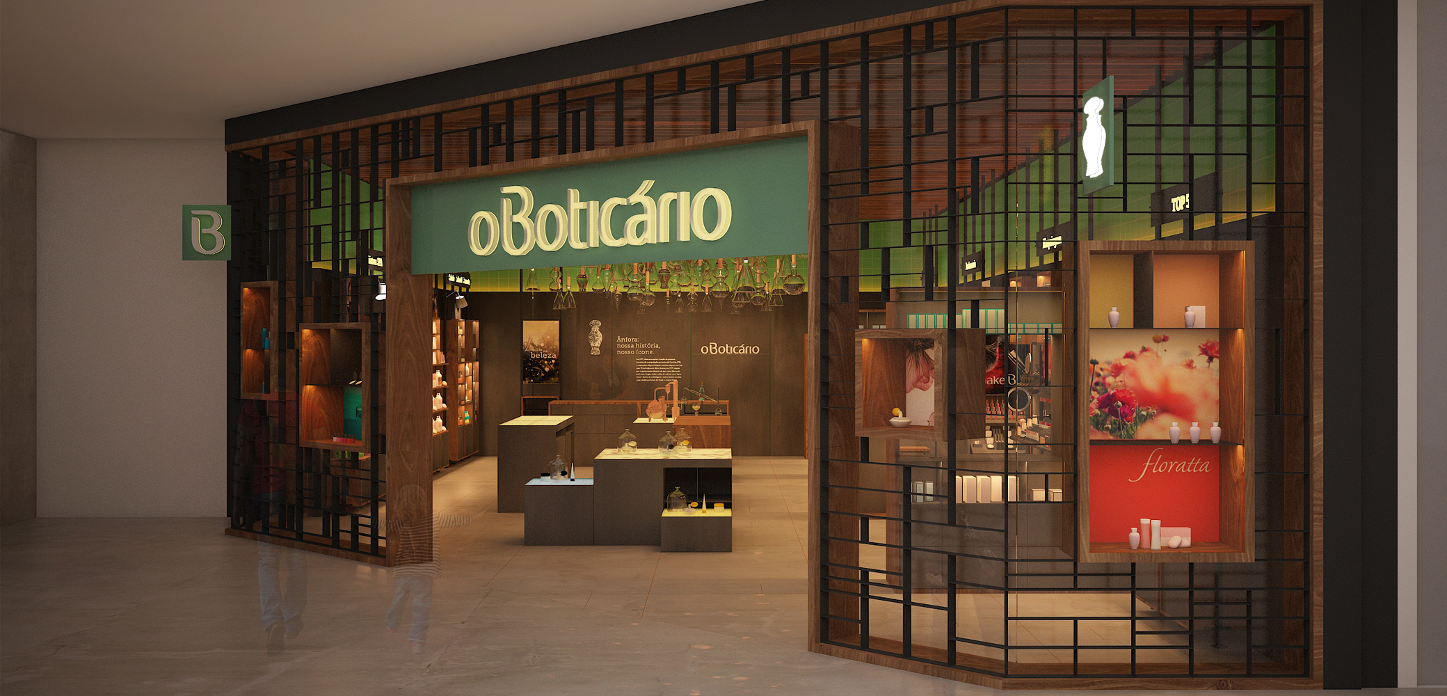
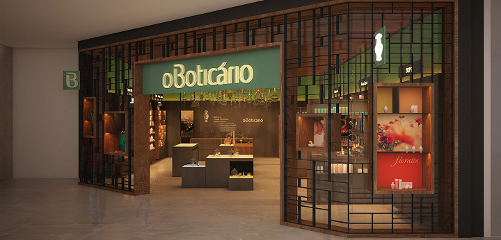
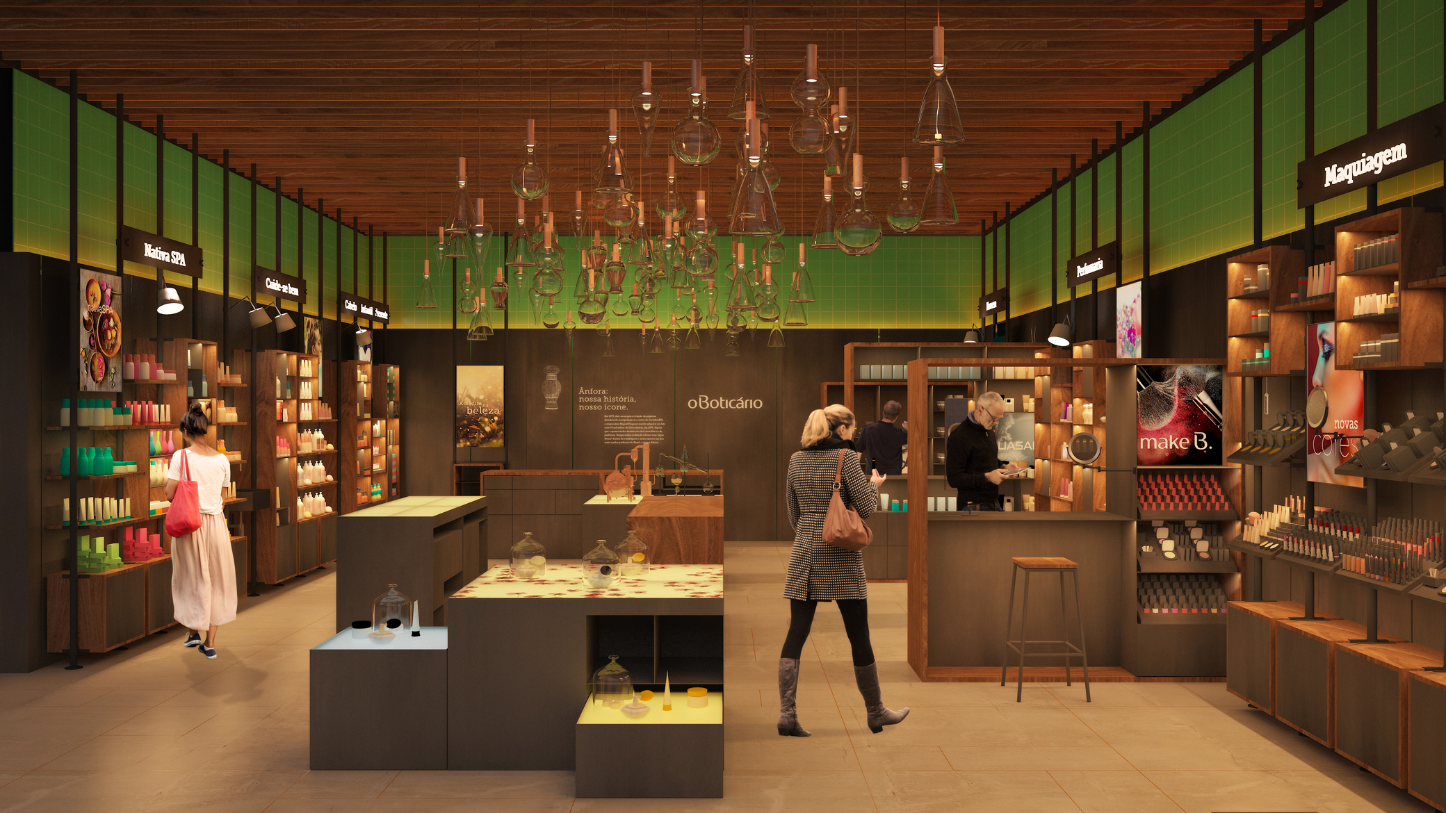
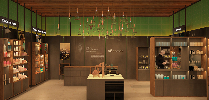
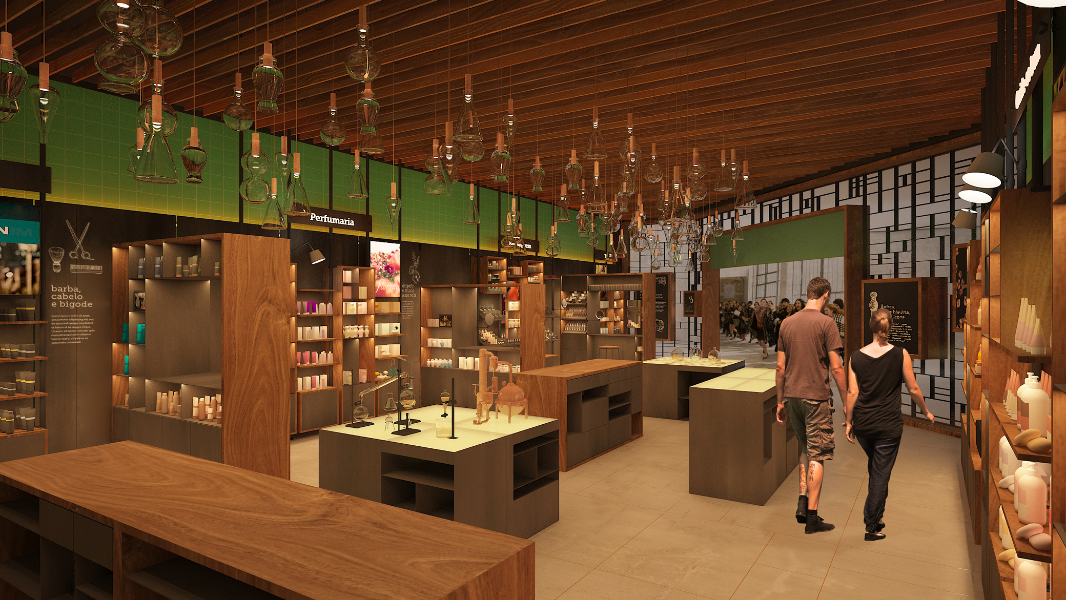
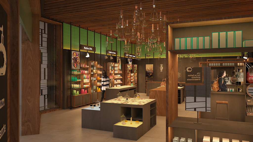
Brazil 2016-2017In the design of the new O Boticário store, the furniture layout, the graphics on the façade, and the overall atmosphere are inspired by the so-called “cabinets of curiosities.” These spaces, which emerged during the European Renaissance and are considered the direct predecessors of modern museums, housed elements from the three branches of biology recognized at the time—animal, plant, and mineral—through collections of notes, drawings, paintings, objects, fossils, and more. To organize such diverse items, cabinets of curiosities relied on a wide variety of “exhibition” devices based on an orthogonal modular system. Using the geometric logic of these spaces, we created a unique, parameterized grid that appears at different scales, construction techniques, and materials throughout the store: flooring, façade, tables, and vertical display units.
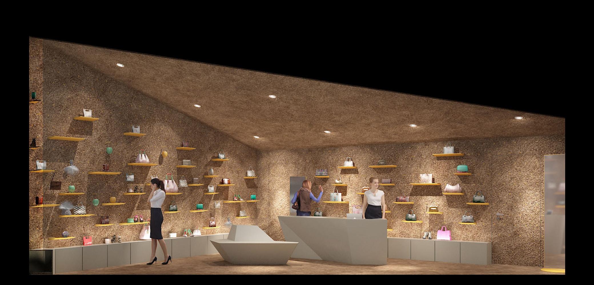


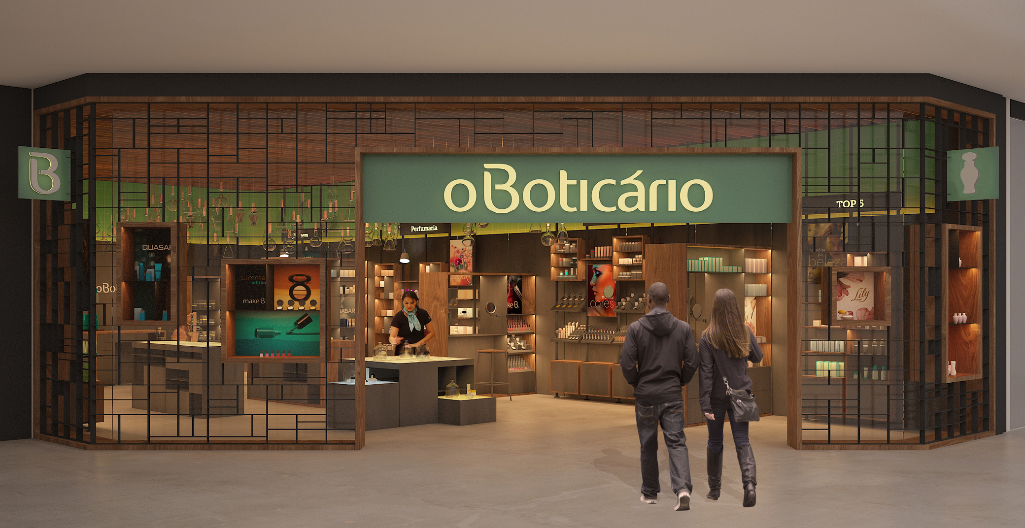
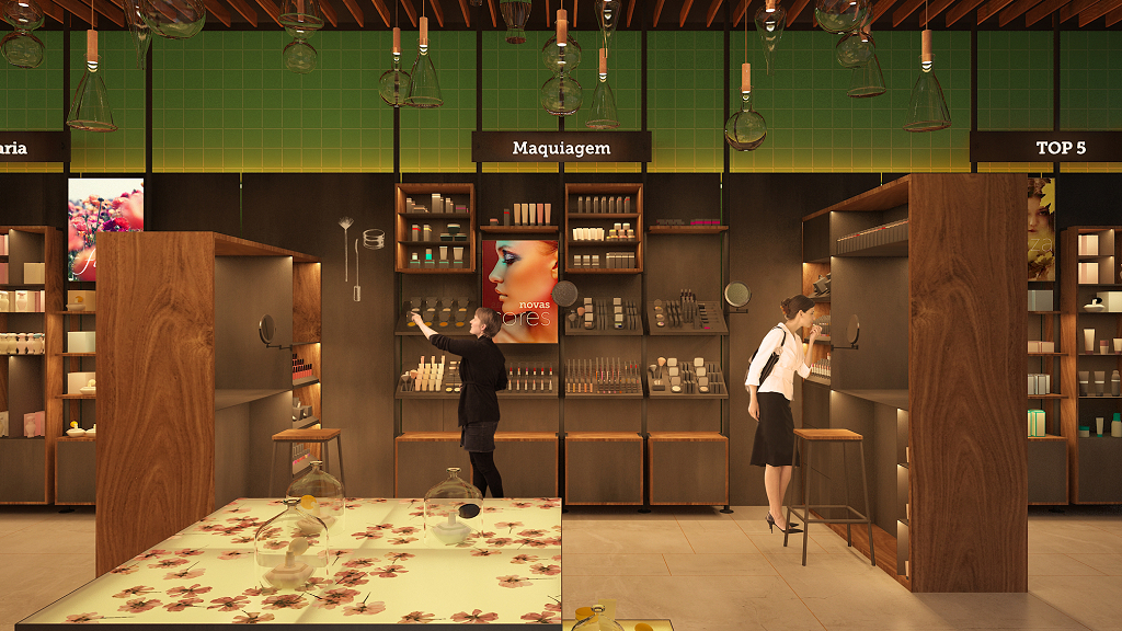
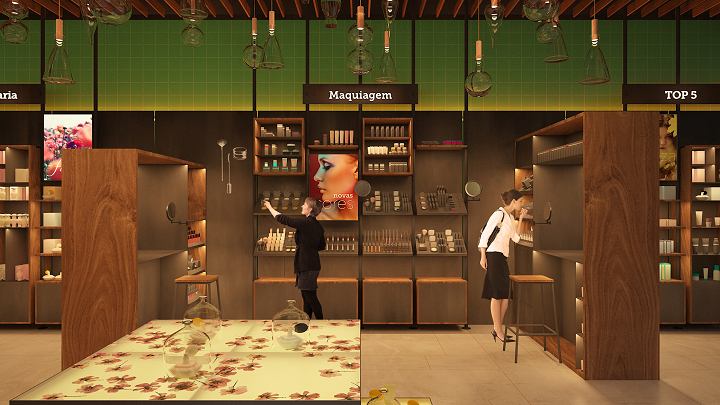
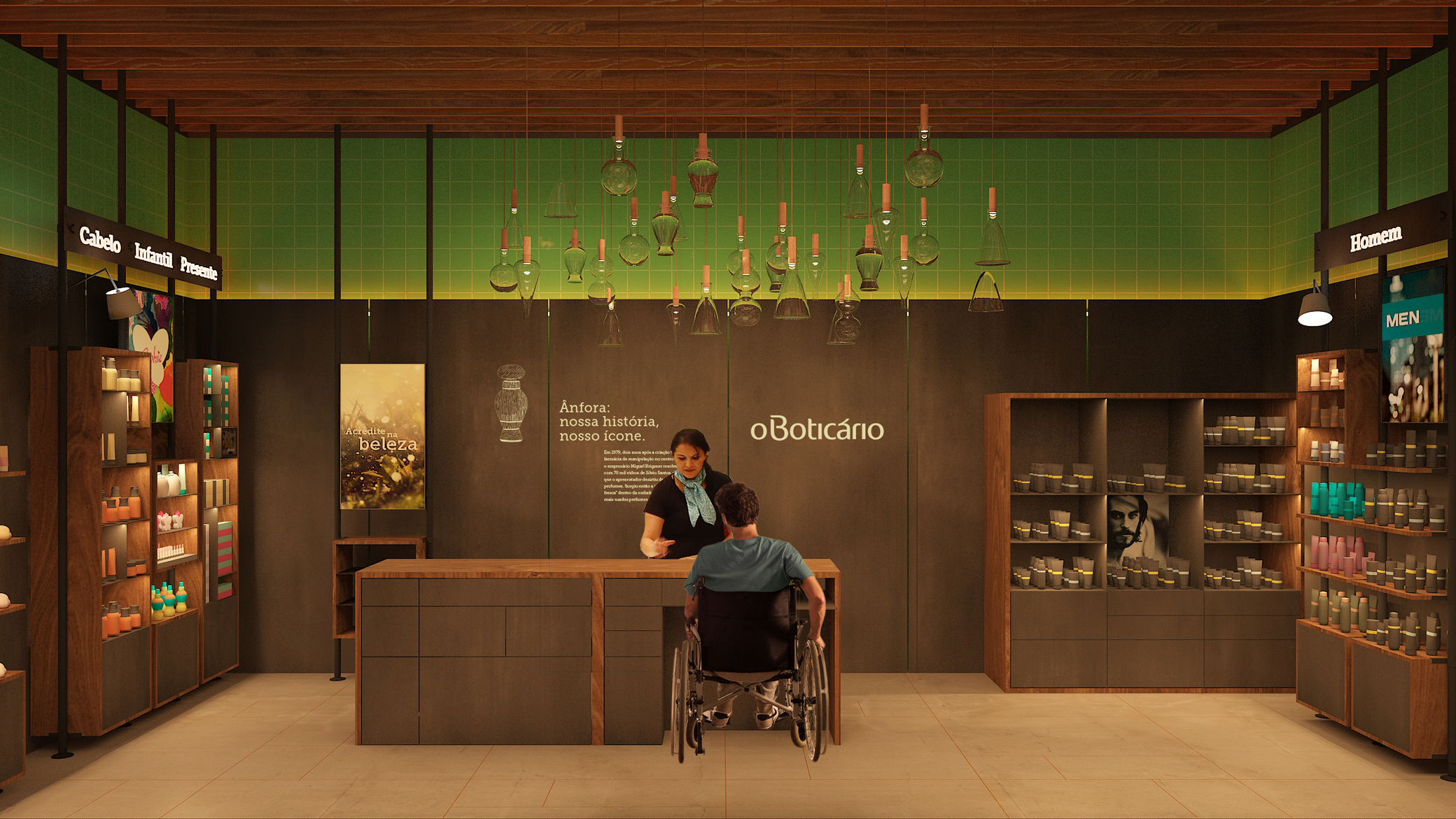
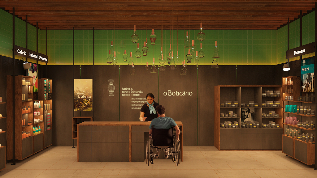
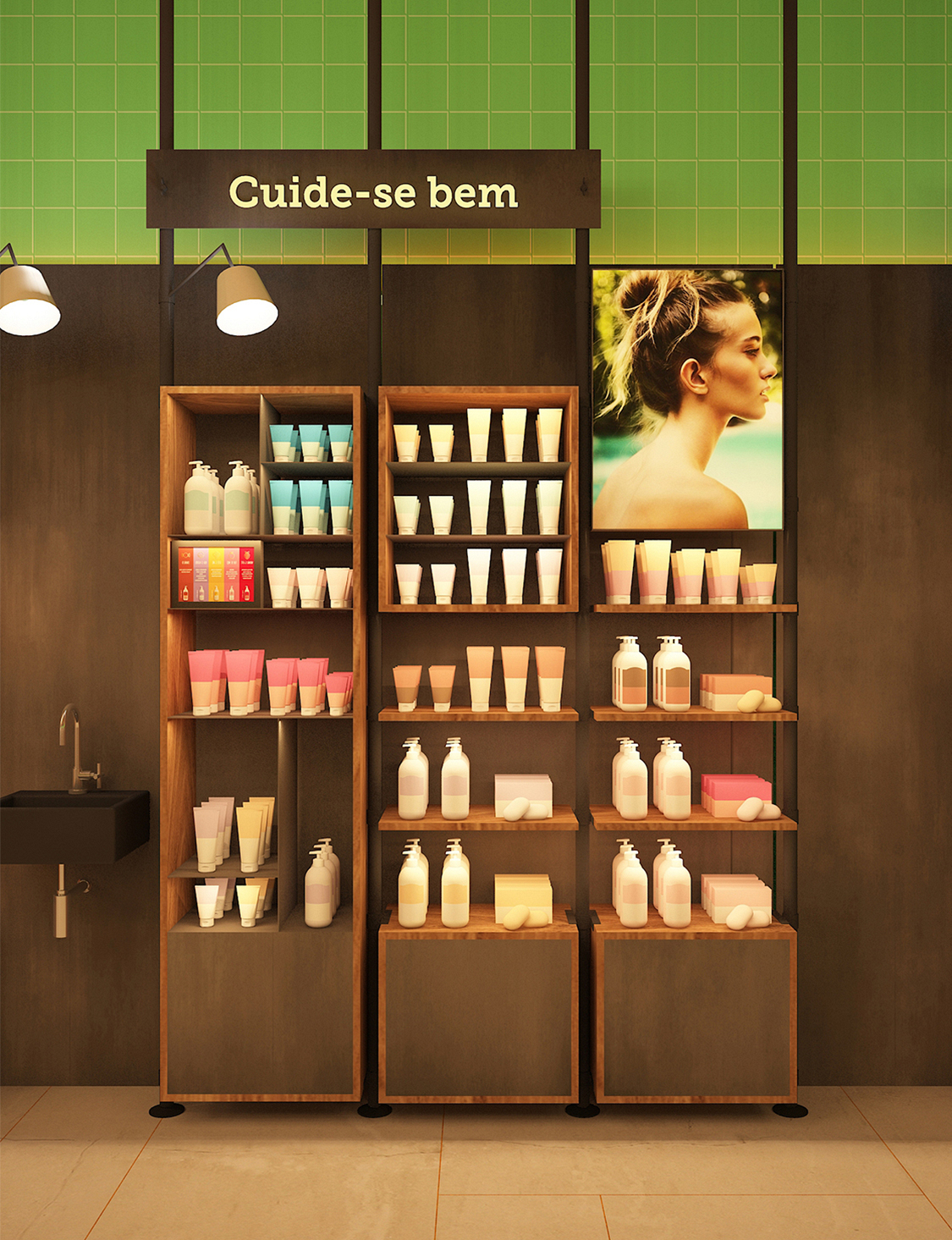
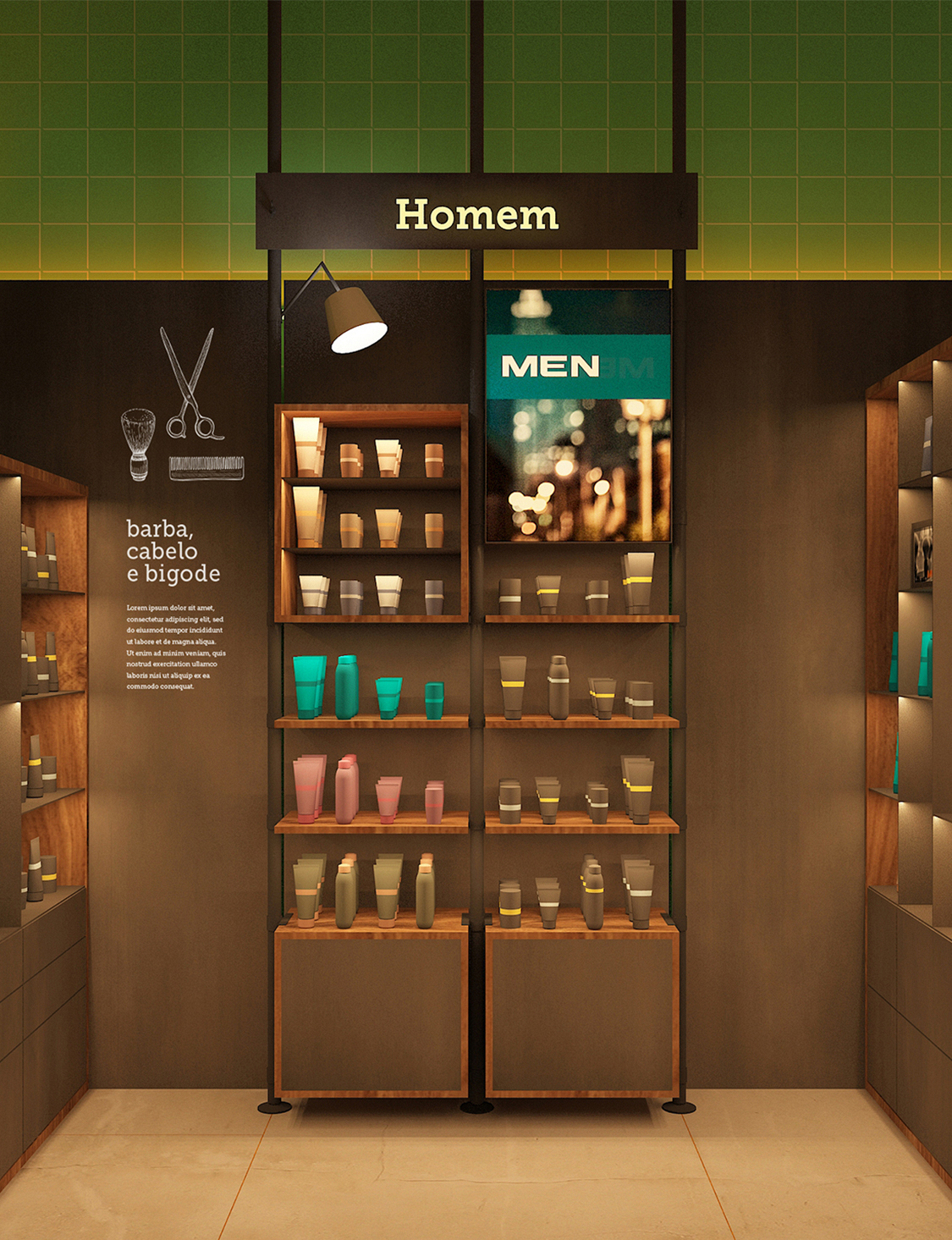
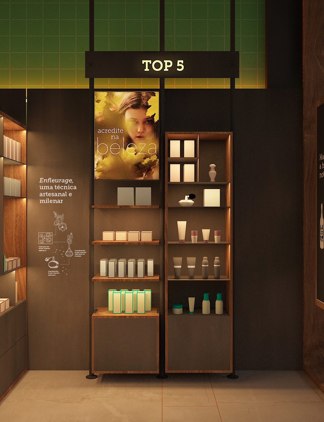
In the store—also understood as the “alchemist’s house”—the reinterpretation of the cabinet language becomes a way to explore the various work environments of the traditional apothecary. A row of cabinets perpendicular to the wall, like in a library, refers to the research area; the central tables represent the workspace filled with references, tools, and inspirations; and the tall display units, reminiscent of classic apothecaries, serve as storage and exhibition for products.
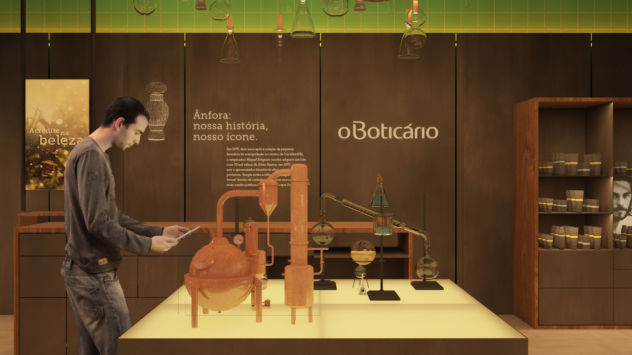
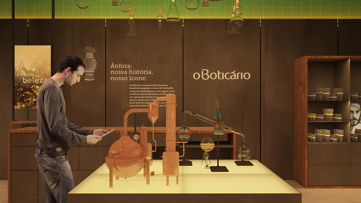
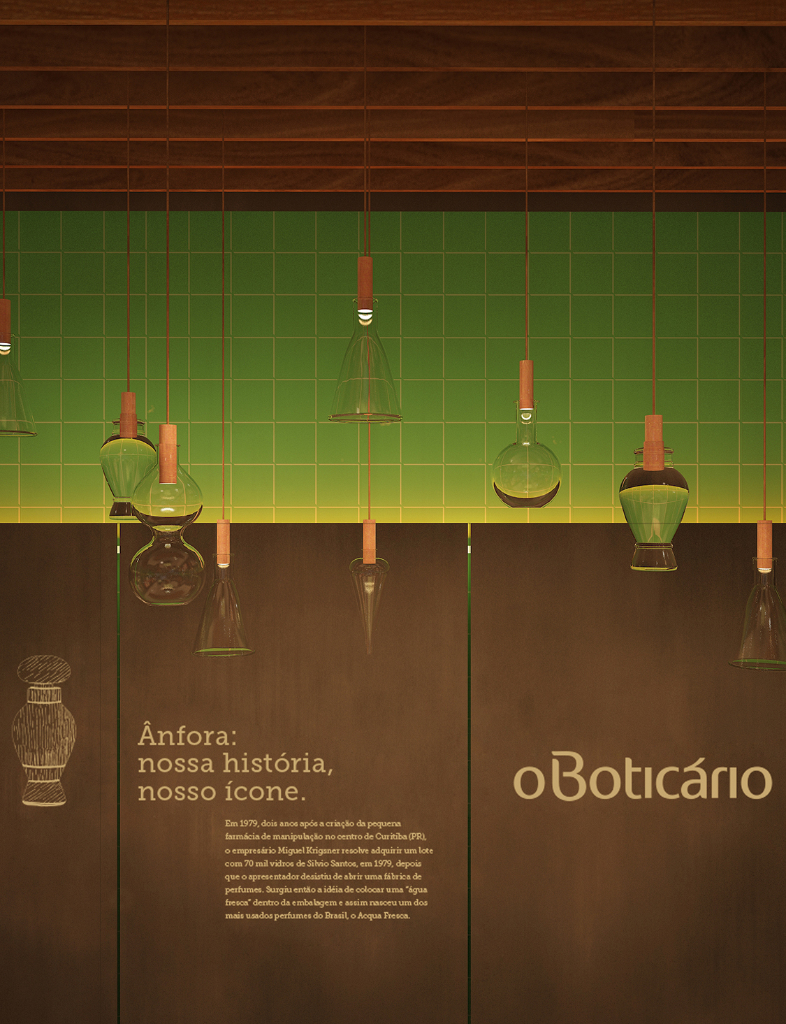
The references for designing the vertical displays come from laboratories, especially from the metal and glass instruments typical of this universe. The “universal support” inspired the creation of a display furniture system that combines several types of supports for showcasing and storing products, along with backlit panels and digital visual merchandising features. Funnels, beakers, flasks, test tubes, Erlenmeyer flasks, and burettes were used to design a luminous installation above the central furniture.
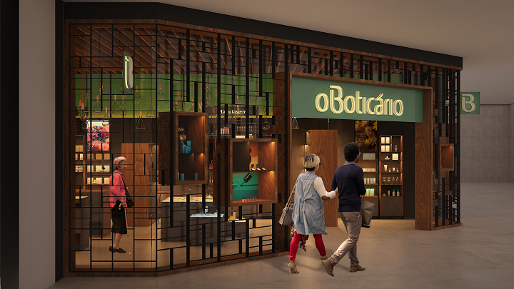
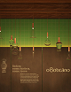
To ensure the main brand stands out over its categories and sub-brands, the architecture needs unity—something capable of synthesizing an atmosphere and projecting a single voice. To achieve this, we created an upper field on the façade and interior walls where the dominant green color asserts the authority of the main brand over the categories and sub-brands. Once this brand hierarchy is established, architecture, visual merchandising, and lighting work together to create sectorization, identity, and emphasis, respectively, for the “heroes” and other sub-brands. These categories are immediately perceived upon entering the store, thanks to the spatial organization, signage, and product identity, and they are arranged within the customer’s natural field of vision, where carbon steel (lead color) and wood predominate.
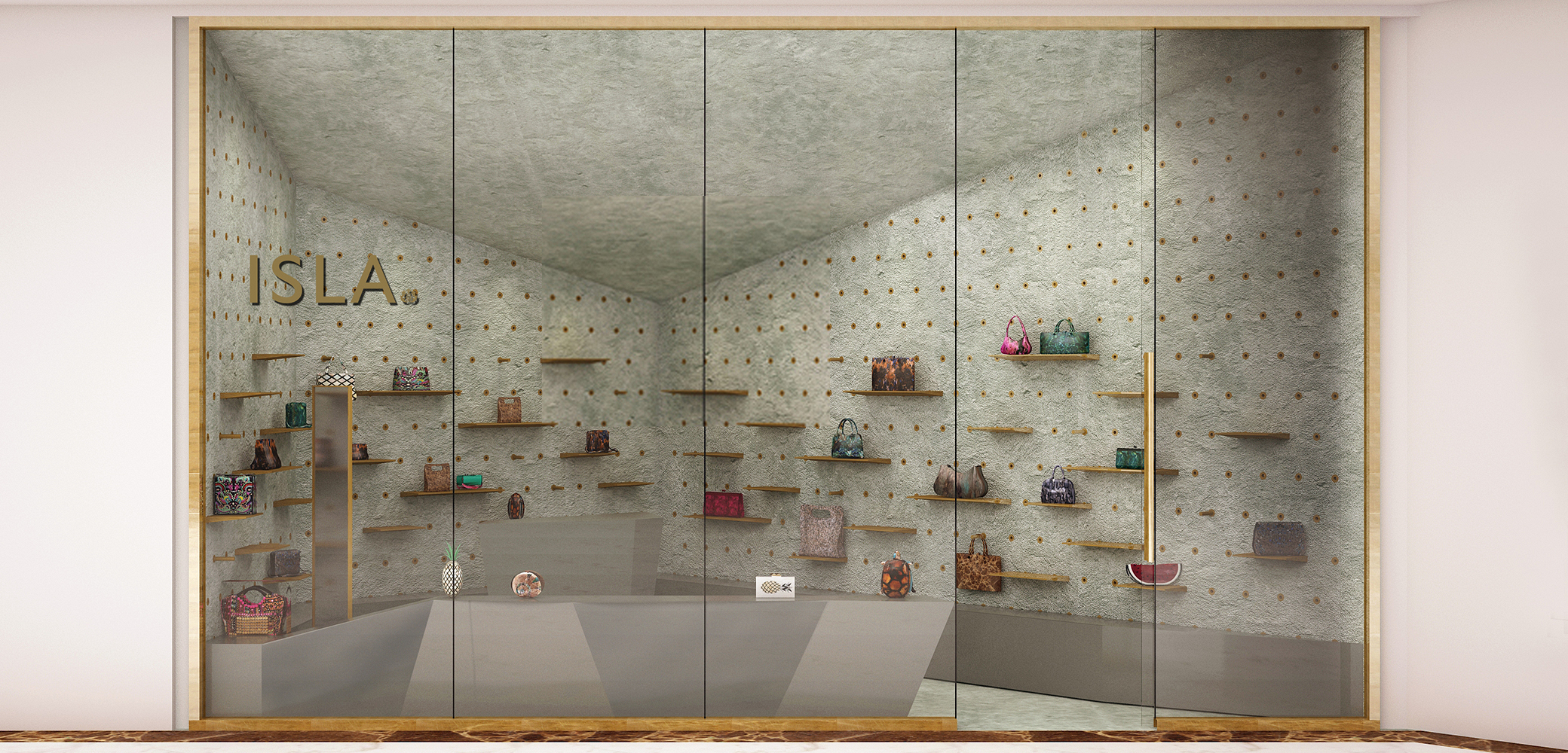
The storefront windows are framed with wooden structures inserted into the metal grid façade. Their internal construction is modular, allowing for seasonal rearrangements or special-date displays. The lighting is designed to support various window compositions, integrated with both movable and fixed shelves.
Project: Boticário Store
Year: 2016–2017
Authors: Bruno Campos, Marcelo Fontes, and Silvio Todeschi (BCMF Arquitetos), Fernando Maculan and Mariza Machado Coelho (MACh Arquitetos)
Team: Marcos Sales, Pablo Gonzalez, Raquel Duarte, Ricardo Lobato
Graphic Design / Signage: Hardy Design
Lighting: Atiaîa Design
Status: Project (competition)